
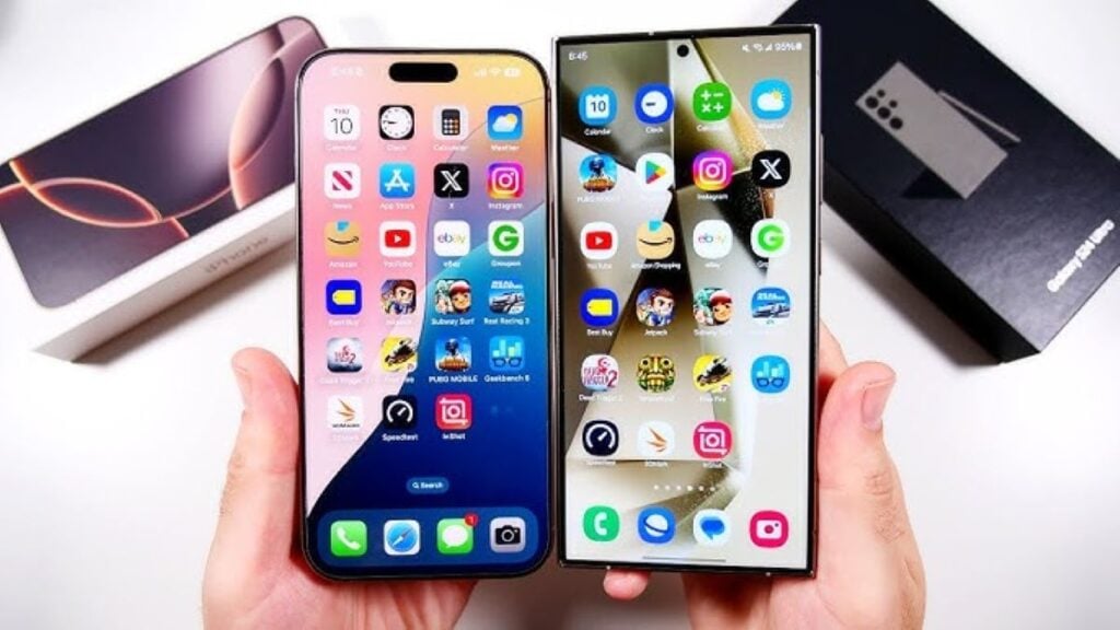

There’s nothing wrong with wanting your Samsung to look like an iPhone. Maybe you switched from iOS and you miss that clean, minimal look. Maybe your friends won’t stop teasing you about the green bubbles. Or maybe you just scrolled through a bunch of “aesthetic phone setup” videos and now you’re itching to make your home screen look like something out of a design magazine. Whatever the reason, you’re not alone — this is one of the most common customization requests out there.
Here’s the thing though: Android and iOS are built completely differently under the hood. iOS is a closed system that Apple controls top to bottom, while Android (especially Samsung’s One UI) is way more open and flexible — which is actually a good thing for us here! It means you can get seriously close to that iPhone look and feel. But it won’t be a perfect, pixel-for-pixel clone, and a few things (like certain system animations or that ultra-specific iOS haptic feedback) just aren’t fully replicable.
The good news? You don’t need to jailbreak anything or do anything sketchy. A combination of a launcher, an icon pack, and a couple of handy Samsung tools will get you like 90% of the way there — enough that people will genuinely double-take. So let’s talk about what you’ll need before you start tapping around.
Before You Start
Before you start swapping stuff around, let’s do a little prep work — trust me, future you will be thankful.
First, back everything up. I know, I know, it’s the most “duh” advice ever, but seriously — take a few minutes to back up your current home screen layout, widgets, and settings (Samsung Cloud or Google’s backup both work fine). Customization apps are generally safe, but every once in a while a launcher update or icon pack glitch can leave your home screen looking like a mess. Having a backup means if you hate the iPhone look, or something breaks, you can snap back to normal in like two minutes instead of rebuilding your whole phone from scratch.
Second, let’s talk about permissions — specifically accessibility permissions. Some of the more powerful customization apps (especially ones that mimic the Control Center or notification style) will ask for accessibility access. This isn’t automatically a red flag, but it is worth understanding what you’re agreeing to: accessibility permissions let an app see a lot of what’s happening on your screen and interact with other apps on your behalf. That’s exactly why they’re useful for deep UI changes — but it’s also exactly why you shouldn’t hand that access out carelessly. Only grant it to apps you trust, and if an app you’ve never heard of is asking for accessibility access just to change your icons, that’s your cue to close out and look elsewhere.
Third — and this one’s important — stick to the Galaxy Store or Google Play Store. I know it’s tempting to sideload some random APK you found on a forum promising “the most realistic iOS launcher ever,” but that’s genuinely one of the easiest ways to end up with malware or a phone full of ads. The official stores vet their apps (not perfectly, but way better than nothing), and honestly, there are more than enough good, legit options available there to get the look you want. No need to take the risk.
Get these three things sorted — backup done, permissions understood, official app stores only — and you’re in a great spot to actually start the fun part: making your Samsung look unmistakably iPhone-ish. 🍏
Step 1: Install an iOS-Style Launcher
Alright, this is where the real transformation begins. If you take away just one thing from this whole guide, let it be this: the launcher is everything.
So what even is a launcher? Basically, it’s the app that controls your home screen — the grid your icons sit in, how your app drawer looks, the animations when you swipe around, the whole vibe. Your Samsung comes with One UI’s launcher by default, and honestly it’s fine, but it looks nothing like iOS. Swapping it out is like renovating a house — you’re not moving to a new address, you’re just completely redoing the inside so it feels like a totally different place.
There are a few solid options depending on how much control you want:
- Launcher iOS 17 — this one’s popular because it’s basically plug-and-play. It mimics the iOS home screen, app switcher, and even the swipe gestures pretty convincingly right out of the box. Great if you just want something that works without a ton of fiddling.
- iLauncher — similar deal, slightly different take on the layout and animations. Worth trying if Launcher iOS 17 doesn’t quite feel right to you — sometimes it just comes down to personal taste.
- Nova Launcher + an iOS icon pack — this is the “power user” combo. Nova isn’t iOS-styled by default, but it’s incredibly customizable, so when you pair it with the right icon pack and some manual tweaking, you can actually get a cleaner, more polished result than the “instant” iOS launchers. It just takes a bit more patience to set up.
My honest advice? If you want something quick and satisfying, start with Launcher iOS 17. If you’re the type who likes tinkering and wants the best possible result, go the Nova route.
Setting it as default is easy either way — once you install the launcher, your phone will usually pop up a prompt asking if you want to use it as your home app. Tap “always” or “set as default,” and boom, your home screen instantly transforms. If you don’t get that prompt for some reason, just head to Settings > Apps > Choose default apps > Home app and pick your new launcher from the list. You can always switch back the same way, so don’t stress about commitment here.
Step 2: Get an iOS Icon Pack
Okay, so you’ve got the launcher in place — but if your icons still look like your regular Android icons, it’s going to feel a little “off,” like wearing a Halloween costume that’s almost right but not quite. This step is what really sells the look.
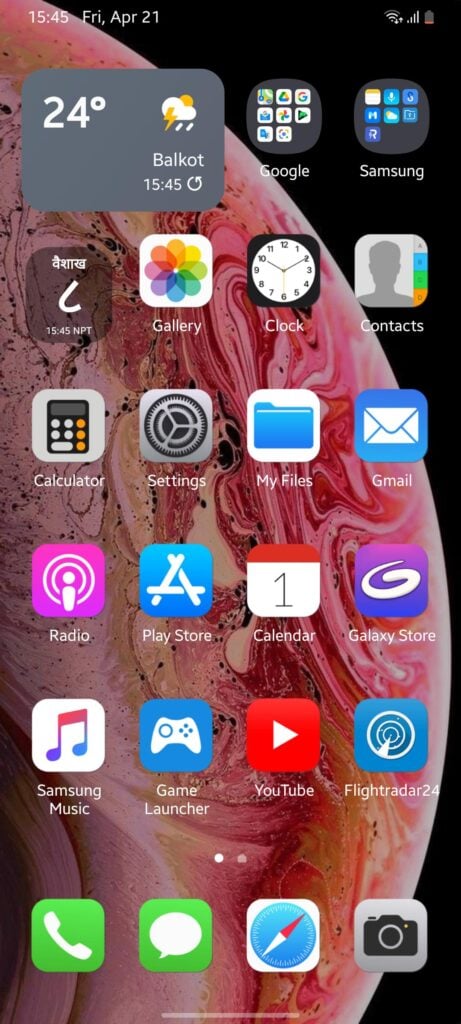
Here’s the deal with iOS icons: they’re all uniform. Same rounded-square shape (that specific “squircle” shape, not just rounded corners), same general sizing, and a pretty consistent design language across the board — even third-party apps end up looking like they belong. Android, by contrast, is the wild west — every app icon is a different shape, size, and style, which is part of why an unmodified Android home screen never quite reads as “iOS” even with the right launcher.
So you’ll want to grab an icon pack that reshapes everything into that clean, uniform squircle style. A few ways to get one:
- Built into your launcher — if you went with Launcher iOS 17 or iLauncher, good news, they usually come with iOS-style icons baked right in, so you might not need to do anything extra here.
- Galaxy Store or Play Store — search “iOS icon pack” and you’ll find a bunch of options with different levels of polish. Some are free, some are paid, and honestly the paid ones are often worth the couple bucks for better coverage of less popular apps.
- Good Lock (Samsung’s own customization app) — this is actually a really underrated option. If you don’t want to fully switch launchers, Samsung’s Good Lock app has modules (like Theme Park or Home Up) that let you apply icon packs and reshape your existing icons without touching your default launcher at all. It’s a nice middle ground if you want some of the look without going all in.
One little heads up: no icon pack covers every single app perfectly, especially smaller or newer apps. You might see a few icons that don’t quite match — that’s normal, not a bug. Most icon packs let you manually customize the stragglers one by one if it really bugs you, but honestly, most people don’t even notice once the majority of icons are matching.
Once your launcher and icon pack are both in place, take a step back and look at your home screen — this is usually the point where it clicks and actually starts looking like an iPhone. Pretty satisfying, right?
Read Also: 10 Hidden Things Your iPhone Volume Buttons Can Do (Besides Adjusting Sound)
Step 3: Recreate the iOS Control Center
This is honestly one of my favorite parts of the whole process, because it’s such a “wow, how did you do that” moment when people see it. You know that swipe-down-from-the-top-right Control Center on iPhone, with all those neat little toggles for Wi-Fi, Bluetooth, flashlight, brightness? Yeah, we can get pretty close to that on your Samsung.
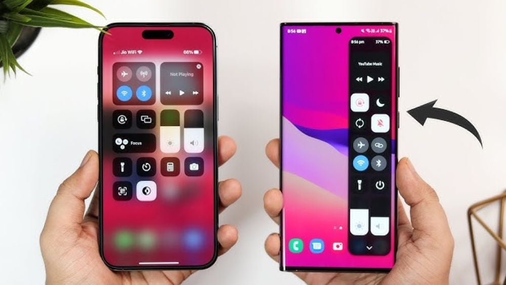
The star of the show here is Good Lock again (seriously, if you haven’t downloaded this app yet, go do it — it’s Samsung’s official customization suite and it’s free). Inside Good Lock, there are modules like NotiStar and other Control Center-style tools that let you completely reskin your quick settings panel. Instead of the default One UI drop-down, you can get that iOS-style grid of rounded toggle buttons, with brightness and volume sliders that actually look and feel like Apple’s.
A couple things to set up once you’ve got the module installed:
- Swipe gestures — on iPhone, swiping down from the top-right corner brings up Control Center, while swiping from the top-left brings down notifications. You can customize your gesture zones in Good Lock (or in your launcher’s gesture settings) to mimic this split. It takes a little muscle memory to get used to, but once it clicks, it genuinely feels natural.
- Quick settings tiles — go through and rearrange your toggles to match the iOS layout as closely as you like. Doesn’t have to be exact, just aim for that clean grid look rather than the long scrolling list Samsung uses by default.
Fair warning: this is probably the fiddliest step so far. It might take a few tries to get the gestures feeling right, and depending on your Samsung model, some Good Lock modules play nicer than others. Don’t get discouraged if it’s not perfect on the first go.
Step 4: Match the Notification Style
Notifications are one of those things you don’t really think about until they look “wrong” — and on Android, the boxy, colorful notification banners are honestly one of the biggest giveaways that you’re not using an iPhone. iOS notifications are simple: clean rounded rectangles, minimal color, and — this is the big one — they group together neatly by app instead of stacking as a messy pile.
The good news is you don’t have to just live with the default Samsung look. A few options here:
- Good Lock’s NotiStar module (yep, it does double duty) also lets you restyle how your notification banners look and behave, getting you closer to that clean, minimal iOS banner style.
- Notification grouping apps on the Play/Galaxy Store can bundle your notifications by app the way iOS does, instead of the more scattered Android default.
- Some launchers (like the ones we mentioned in Step 1) also come with their own notification shade replacements that match the rest of the iOS aesthetic, so if you’re already using one of those, check its settings before installing anything extra.
One honest note here: notification behavior is one of the trickier things to fully replicate because it’s so tied into Android’s core system. You’ll get it looking really close, but if you’re someone who pays super close attention to animation timing and micro-interactions, you might still notice small differences. That said, for 95% of people (and anyone glancing at your phone over your shoulder), it’ll read as “iPhone” without a second thought.
Step 5: Change Fonts and System UI Elements
Okay, small detail, but this one matters more than you’d think. iOS uses Apple’s own font, San Francisco — and once you’ve seen enough iPhones, your brain just kind of recognizes it, even subconsciously. Keeping Samsung’s default font is one of those subtle things that can make an otherwise great iOS-style setup still feel slightly “off.”
Luckily, this is a pretty easy fix:
- Samsung’s built-in font changer — head to Settings > Display > Font size and style, and you can browse fonts directly from there. Search for San Francisco-style options (they’re usually labeled something like “SF Pro” or similar).
- Good Lock’s FontStyle module — if you want more control or the built-in options are limited on your device, this module gives you a wider selection and finer-tuned settings for how the font applies system-wide.
While you’re in there, it’s worth taking a minute to also glance at your text size and system colors. iOS tends to run a slightly different scale and a more muted, neutral color palette in its system UI compared to Samsung’s default, which can lean a bit more saturated. You don’t need to obsess over getting it pixel-perfect, but nudging your text size down slightly and toning down any bold accent colors in your settings menus can help everything feel more cohesive with the rest of your new look.
Small step, but it’s the kind of detail that ties the whole thing together — like the finishing touches on a room makeover.
Read Also: See a green dot on your Android phone? This is what it means
Step 6: Customize the Lock Screen
Your lock screen is the first thing you (and everyone else) sees every single time you pick up your phone, so it’s worth spending a little extra time getting this one right. And honestly, it’s one of the easier wins on this whole list.
Layout first. iPhone’s lock screen has that signature look — big clock roughly centered/upper-middle, with widgets often sitting just below it. Samsung’s default lock screen puts things in slightly different spots and has its own widget style. Head into Settings > Lock screen and you’ll find options to reposition your clock and add/rearrange widgets. It won’t be pixel-identical to iOS (Samsung’s widget system works a bit differently under the hood), but you can get the general layout — clock up top, useful info just beneath it — feeling really similar.
Wallpaper is huge here, maybe more than people realize. One of the most iconic things about iOS lock screens is that “depth effect” wallpaper trick, where your subject appears to sit in front of the clock, like it’s popping out of the screen. You don’t need an iPhone to pull this off — search “depth effect wallpaper” on the Play Store or Galaxy Store and you’ll find apps that create this exact look using your own photos, or you can grab pre-made ones if you don’t have a good depth photo handy. It’s a small trick but it makes a huge visual difference — genuinely one of those “wait, how’d you do that” moments.
Always-on display is the last little touch. iOS’s AOD tends to be minimal — dimmed clock, maybe a couple small widgets, nothing too busy. Samsung’s AOD settings (under Settings > Lock screen > Always On Display) let you simplify things down to a similar clean, low-key look. Less is more here if you’re going for that Apple minimalism.
Step 7: Get iMessage-Style Texting (Optional)
Okay, I want to be upfront about this one because I don’t want you disappointed: this step is purely cosmetic. There is no way to actually get real iMessage on Android — it’s a closed Apple system, full stop, no app can trick their servers into thinking your Samsung is an iPhone. So if the goal is to genuinely message Apple users through iMessage, that’s just not on the table.
But — if what you’re really after is the look of it (the bubbles, the fonts, the little “delivered” text, all that), there are apps that recreate that aesthetic pretty convincingly for your own texting/messaging use. They’ll style your messages with that blue-bubble-for-you, gray-or-green-for-them look, mimic the send animations, the whole vibe. It’s basically a skin over your existing messaging app.
Just manage your expectations here — this is 100% for looks, not function. Your messages are still going out as regular SMS/RCS or whatever messaging service you’re actually using underneath. Think of it less like “hacking iMessage” and more like “cosplaying as iMessage.” If you’re doing this to impress someone by “texting from an iPhone,” it’s not going to fool anyone who actually looks closely — but if you just like the aesthetic for yourself, go for it, no shame in that.
Step 8: Camera App and UI Tweaks (Optional)
Last one, and this is purely for the aesthetic-lovers out there. There are camera apps on the Play/Galaxy Store designed to visually mimic the iPhone camera app — same button placement, same mode-switching layout (swiping between Photo, Video, Portrait, etc.), same general clean, minimal interface Apple’s known for.
But — and I really want to be clear on this one — installing an iOS-style camera app does not give you an iPhone’s camera. Your actual photo quality, color processing, dynamic range, all of that is determined by your Samsung’s hardware and Samsung’s own image processing algorithms, not by what the buttons on screen look like. An iOS-style camera app is genuinely just a costume change for your camera — same sensor, same lens, same processing underneath, just wearing a different outfit.
So if you’re going into this hoping your photos will suddenly start looking like they came off an iPhone, that’s not quite how it works. But if you just like that clean interface and want your camera app to visually match the rest of your new iOS-themed setup, it’s a nice little finishing touch that keeps everything feeling consistent.
Read Also: 12 Surprisingly Simple Ways to Make Your iPhone Battery Last Longer
Limitations to Keep in Mind
Before you go full send on this whole project, let’s have a quick, honest chat about what this setup can and can’t do. I’d rather you know this upfront than get a few hours in and feel let down.
Some stuff genuinely needs root access. Root basically means getting deep, unrestricted access to your phone’s core system — way beyond what a launcher or Good Lock module can touch. Certain super specific System UI elements (think really granular animation behaviors or deep system menus) are only changeable if you root your device. I’m not going to walk you through rooting here, and honestly, for most people it’s not worth it — it can void your warranty, introduce security risks, and the juice usually isn’t worth the squeeze for a handful of tiny visual tweaks. Everything we covered in this guide works totally fine without rooting anything, so don’t feel like you’re missing out by skipping it.
Heads up on performance. Running a custom launcher, an icon pack, a few Good Lock modules, and some extra styling apps all at once does add a little overhead. You might notice slightly more battery drain or a bit more RAM usage compared to stock Samsung software, especially on older or budget devices. For most modern Samsung phones this’ll be barely noticeable, but if your phone’s already feeling a little sluggish, just keep an eye on things after you finish setting everything up — and know that uninstalling any of this stuff later is quick and painless if it ever becomes a problem.
And lastly — updates can mess with your setup. Every so often Samsung or Android pushes a system update, and occasionally that update changes something under the hood that a launcher or module was relying on. When that happens, you might notice a glitch, a crash, or something just looking slightly off until the app developer pushes their own update to catch up. It’s usually a minor, temporary annoyance rather than a huge deal, but it’s worth knowing it can happen so you’re not caught off guard.
None of this is meant to scare you off — just going into it with realistic expectations means you’ll actually enjoy the process instead of getting frustrated when something’s not 100% perfect.
Conclusion
So, let’s zoom back out for a second. If you only have twenty minutes and want the biggest bang for your buck, focus on the launcher and icon pack — those two alone will transform your home screen more than anything else on this list, and they take almost no effort to set up. Everything after that (Control Center, notifications, fonts, lock screen) is where you go from “looks kinda like an iPhone” to “wait, is that actually an iPhone?”
And the optional stuff — the iMessage bubbles, the camera app skin — that’s really just for people who want to go all the way and have fun with the details.
Here’s my honest take though: you don’t have to replicate everything on this list to get a great result. Pick and choose based on what actually matters to you. Maybe you just want that clean home screen and don’t care about the Control Center. Maybe the depth-effect wallpaper is the one thing you’re excited about and everything else is optional. There’s no rule saying you have to do all eight steps — this is your phone, so make it look the way you want it to look.
At the end of the day, this isn’t really about tricking anyone into thinking you have an iPhone — it’s about taking the parts of iOS’s design you genuinely like and blending them with everything Android does better (the customization, the flexibility, the fact that you can do all this in the first place). You kind of get the best of both worlds: that clean, minimal aesthetic you love, running on a platform that actually lets you make it your own.
So go have fun with it. Tweak things, try a few different launchers if the first one doesn’t feel right, swap wallpapers until one clicks. There’s no wrong way to do this — just the way that makes your phone feel like yours.